Charts
rayleighconnect™ features various types of charts offering a comprehensive visual representation of energy consumption and related parameters, enabling users to analyze data efficiently and make informed decisions.
Charts serve as effective communication tools, enabling stakeholders to convey information, trends, and performance metrics visually. Regardless of the chart type, visual representations of data facilitate communication and collaboration among stakeholders by providing a common understanding of key metrics and trends.
Bar Charts for Energy Consumption
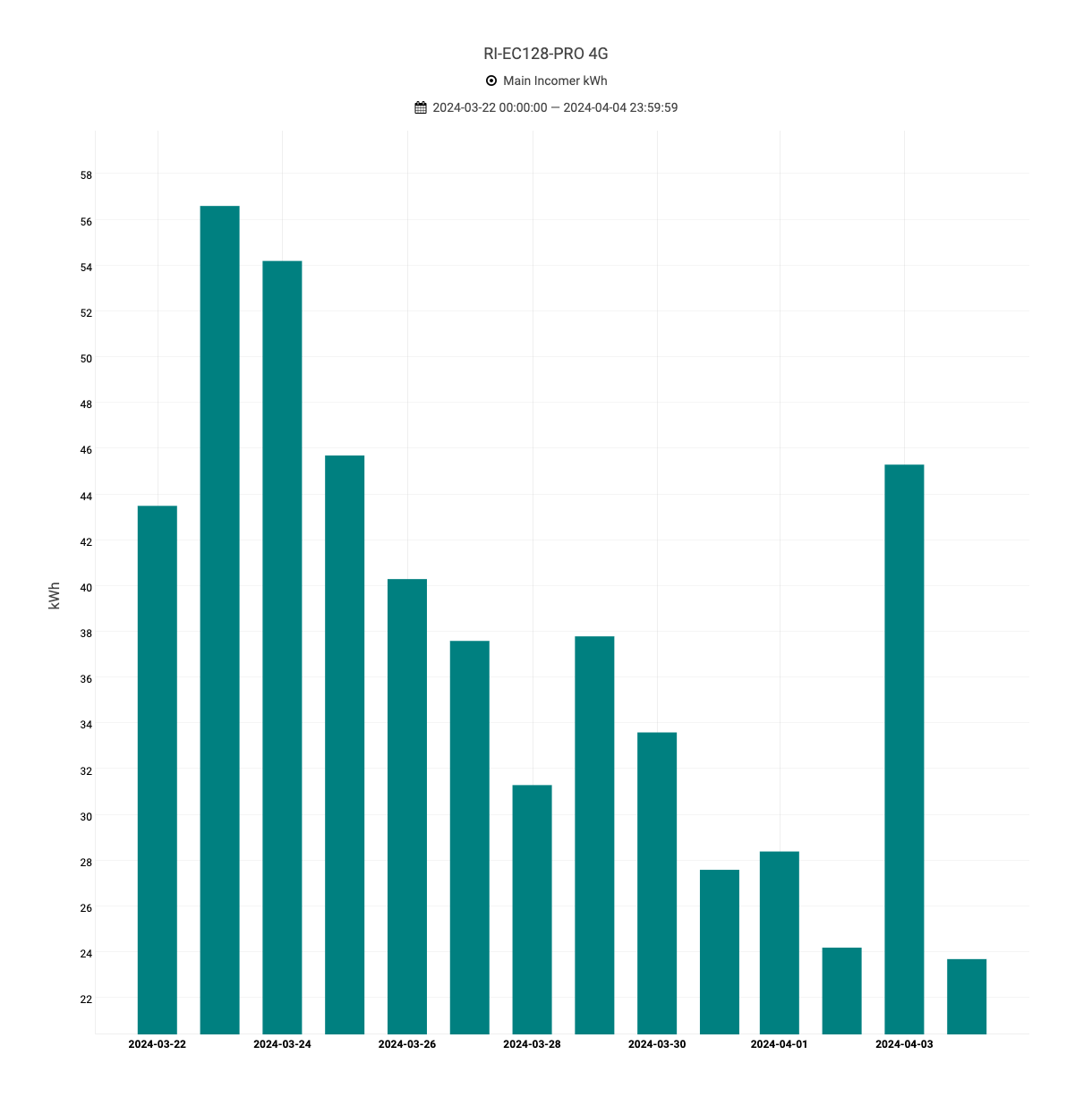
Bar charts provide a clear visualization of energy consumption across different time periods, such as minutely, hourly or daily.
Each bar represents the amount of energy consumed within a specific timeframe, allowing users to quickly identify peak consumption periods and trends.

Line Charts for Parameter Analysis
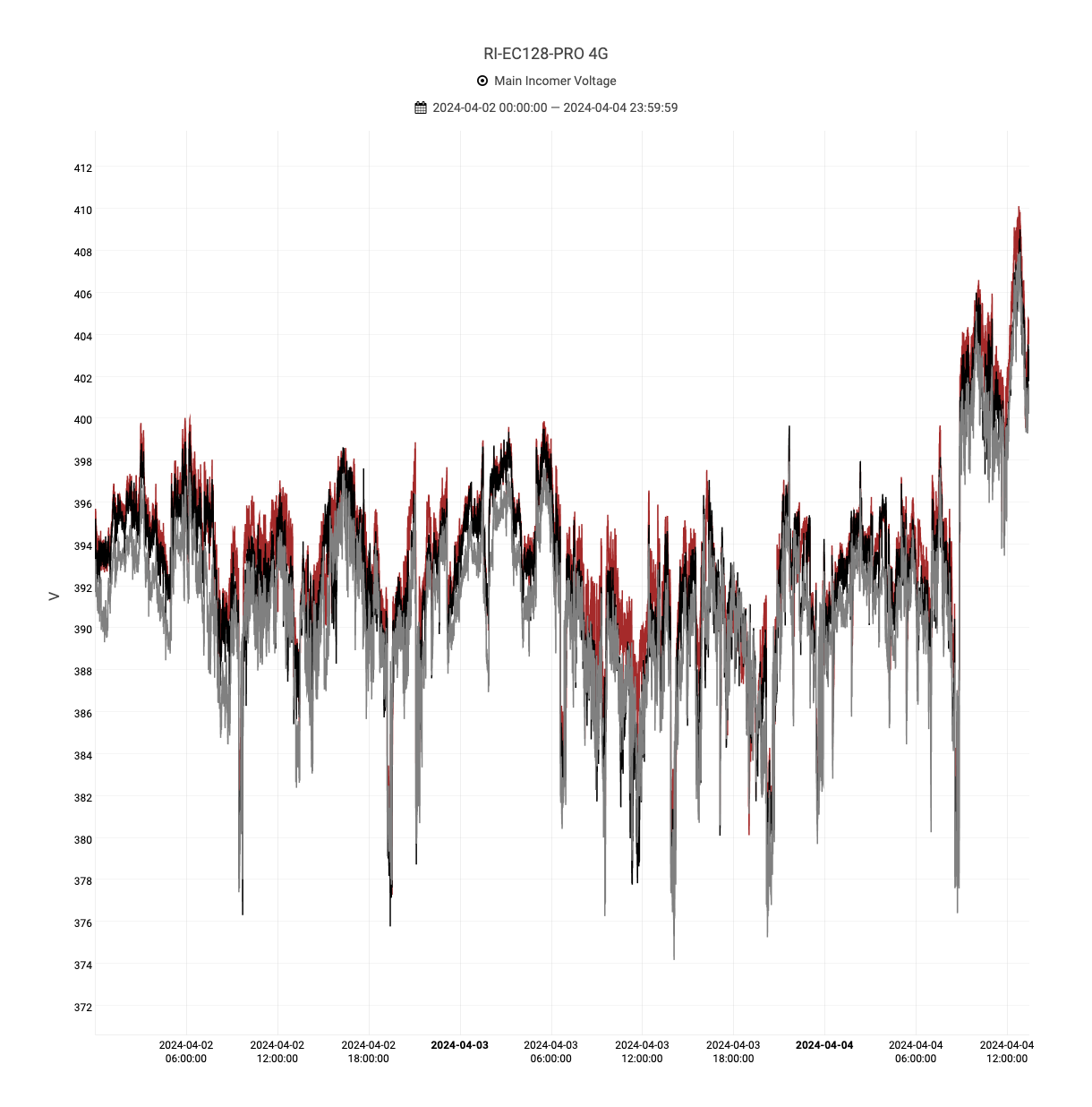
Line charts are an effective way to visualize electrical parameters such as voltage, current, power factors, and other related metrics in energy monitoring.

Interactive Features and Data Exploration
The module offers interactive features, such as zooming, panning, and data highlighting, to facilitate detailed exploration of energy consumption and parameter trends.
Users can interact with charts dynamically, drilling down into specific timeframes or data points to gain deeper insights and identify opportunities for optimization.
Export Options
Users can export bar and line chart visualizations as image files, PDF reports, or CSV data for further analysis or sharing with stakeholders.