Custom charts
Note
Custom charts feature is a part of "Archival data visualization" package.
Overview
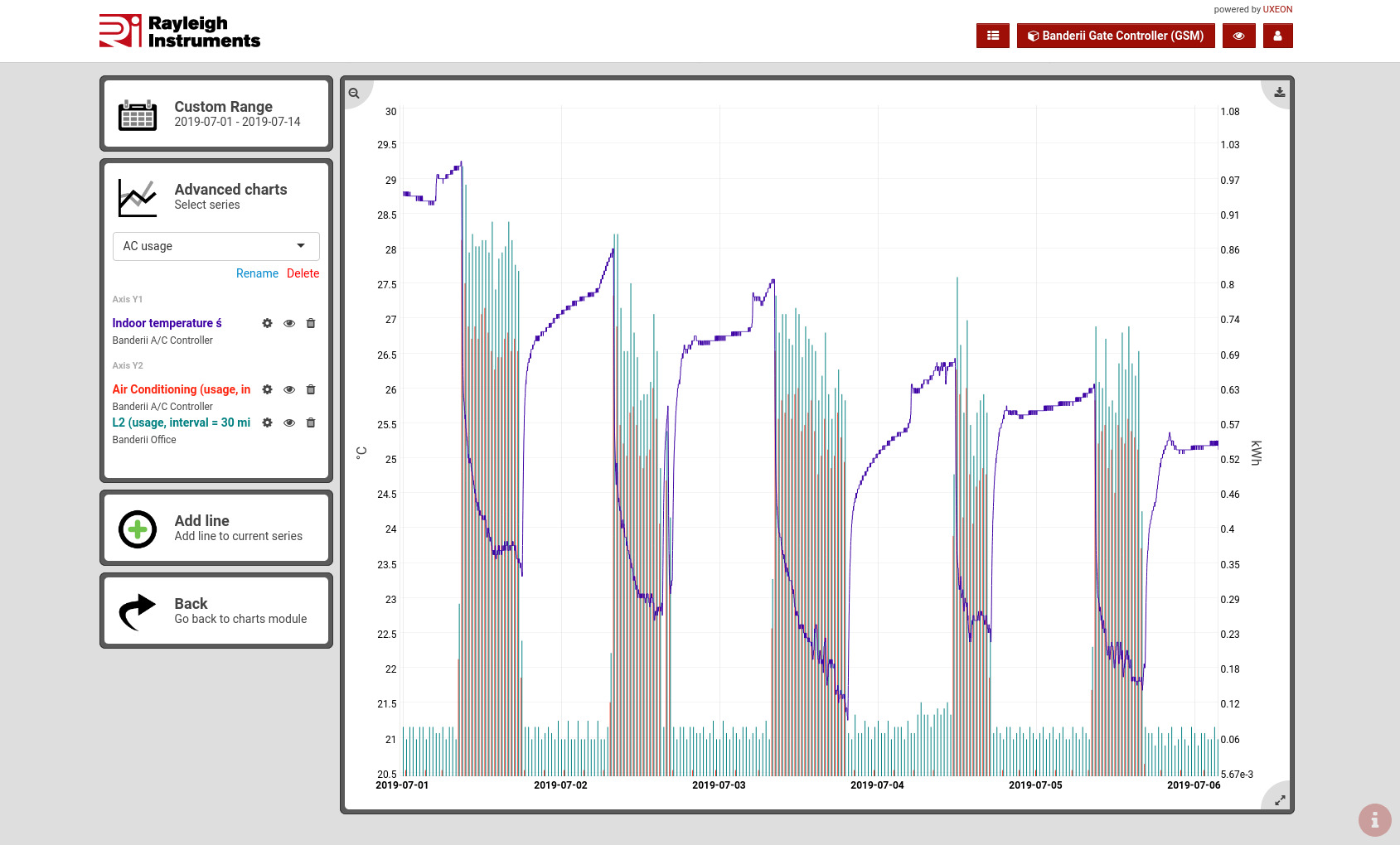
Main features
- Two Y-axes enable you to display data with different units on a single chart.
- Multiple sensors can be added to both Y-axes.
- Data can be sourced from any sensor and from multpile sites (gateways).
- Once you define the advanced chart it stays saved and can be easily revisited.
- Chart can be exported as an image using a button in top-right corner.
Creating new advanced chart
To add a new advanced chart:
- Click on a dropdown menu on the left and select "+ Add New".
- System will ask you to select first data source
- Chart will be created with the name of first sensor.
It can be changed by clicking on Rename below the dropdown. - Adding more data sources to the selected advanced chart is done by clicking on "Add line" widget on the left.
Selecting data range

Thanks to unlimited data storage available in standard subscription you can easily access data from any period. Moreover, the data from a month ten years ago will load as fast as data from last month.
You can choose from predefined periods like:
- "Today"
- "Last 3 days"
- "This month"
- "Last month"
- etc.
or select a custom date range using a built-in calendar.
Adding data to chart
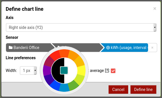
Multiple sensors can be added to single chart.
Each one can be configured with:
- custom color
- line width and assigned to one of two Y-axes.
Zoom in/out
After the chart is loaded you can click-and-drag over the chart area to zoom in. Both horizontal and vertical zooms are supported.
Double click to zoom out.