Pie Charts
Pie charts module allows you to quickly compare multiple energy metering points.
Overview
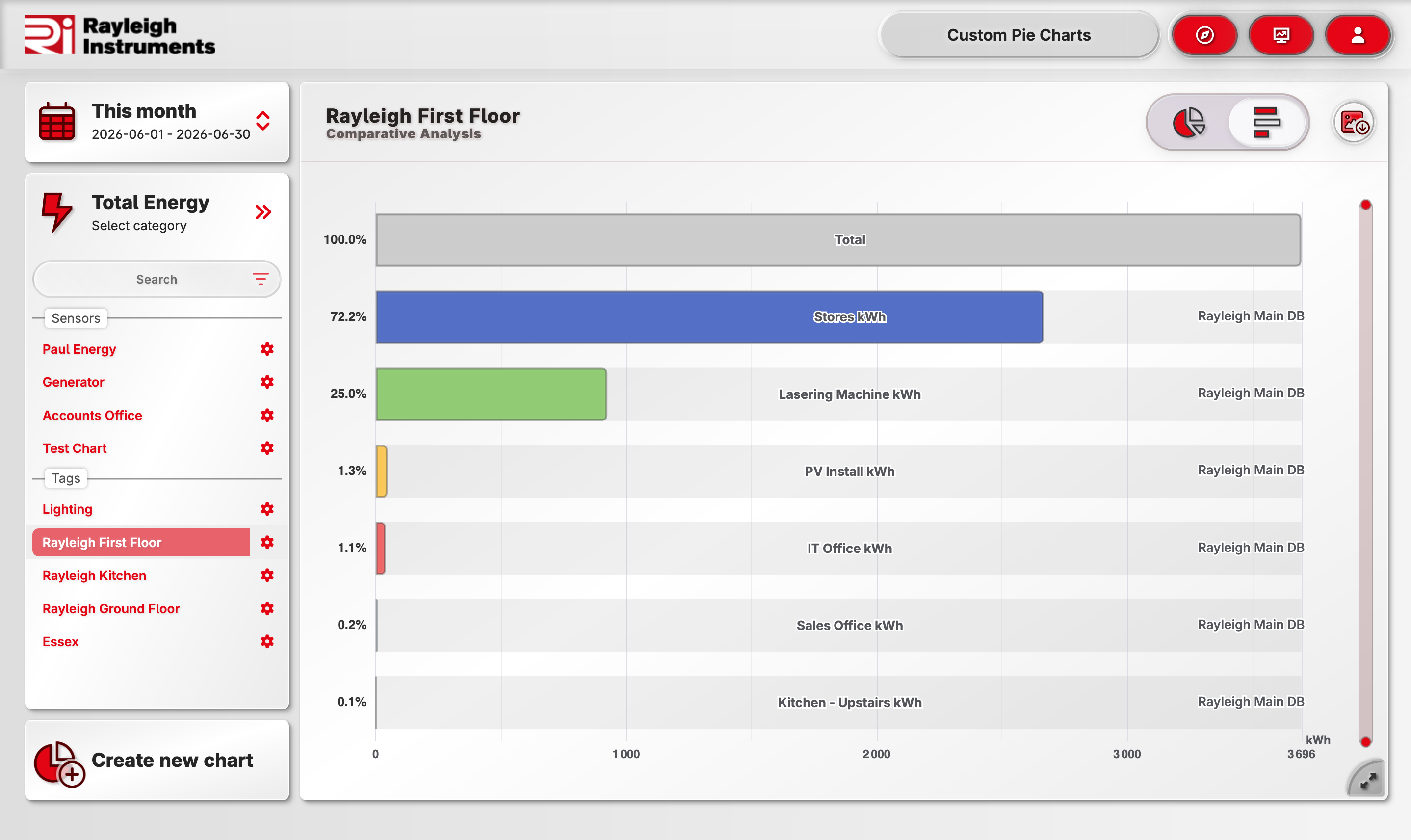
Bar chart mode
Pie chart can be toggled with a single click to a bar chart.
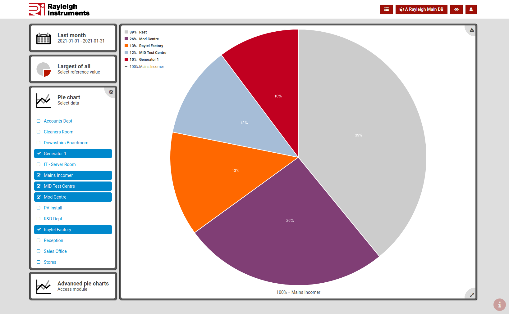
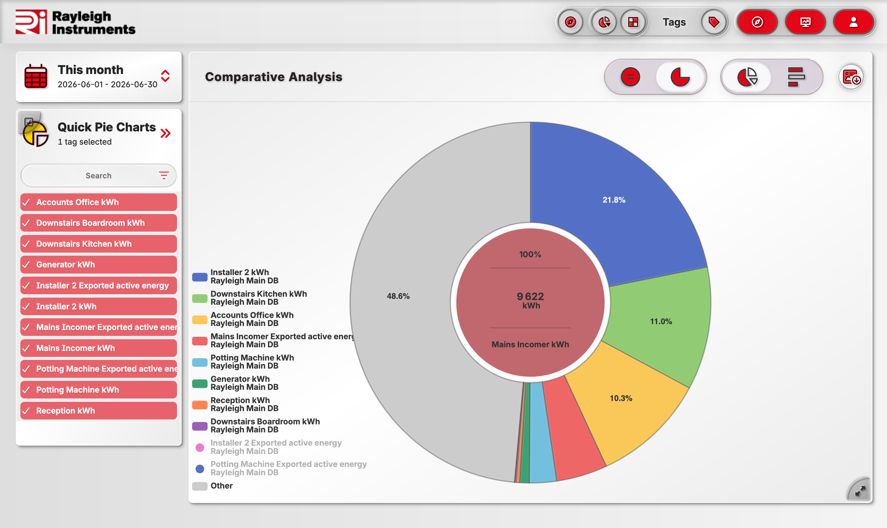
Values selection
There are following ways to select content of pie chart:
- using previously assigned tags
- all energy meters linked to selected gateway
- custom selection
Reference value
There are two available modes for "reference value":
-
"Sum of all"
Sum of all values is 100% of the chart.
This is the default pie chart mode.
-
"Largest of all"
Largest value is 100% of the chart.
Use when one of the energy meters is Main Incomer to view values as part of total energy import.
Selecting data range
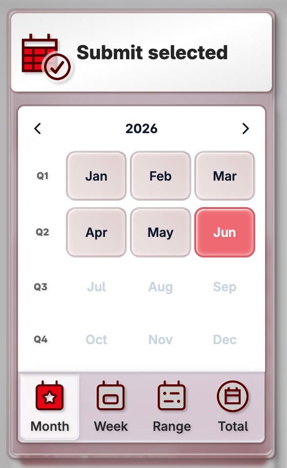
Built-in calendar
You can easily select month, week or any custom range.
Archival data
Thanks to unlimited data storage available in standard subscription you can easily access data from any period. Moreover, the data from a month ten years ago will load as fast as data from last month.
Data category
Energy, tariffs, KPIs and more
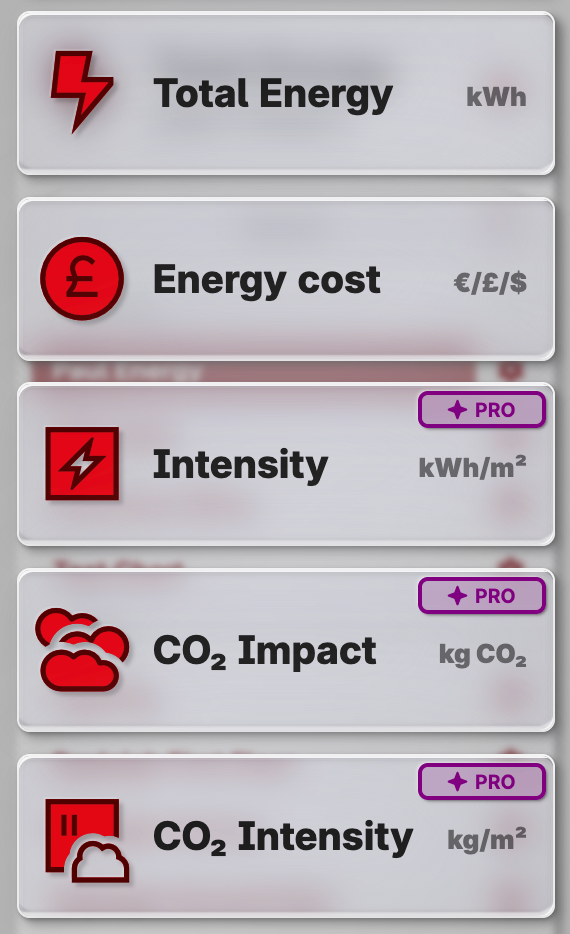
Pie charts module is capable of displaying values like:
- energy (kWh)
- cost calculated based on tariffs
- energy intensity per square meter
- CO2 impact and intensity
Note
Available options depend on subscription tier.
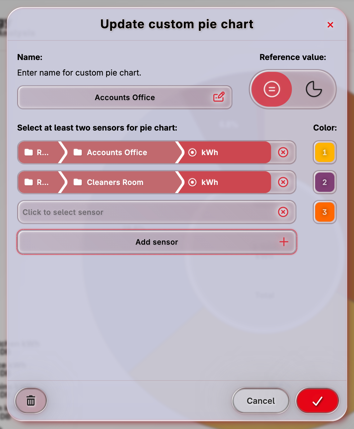
Custom pie charts
With custom pie charts it is possible to:
- Select custom colors and series.
- Save and re-use configurations.
- Embed pie charts on custom dashboards.
Creating custom pie charts
rayleighconnect™ provides two easy to use ways to create custom pie charts:
-
Select using tags
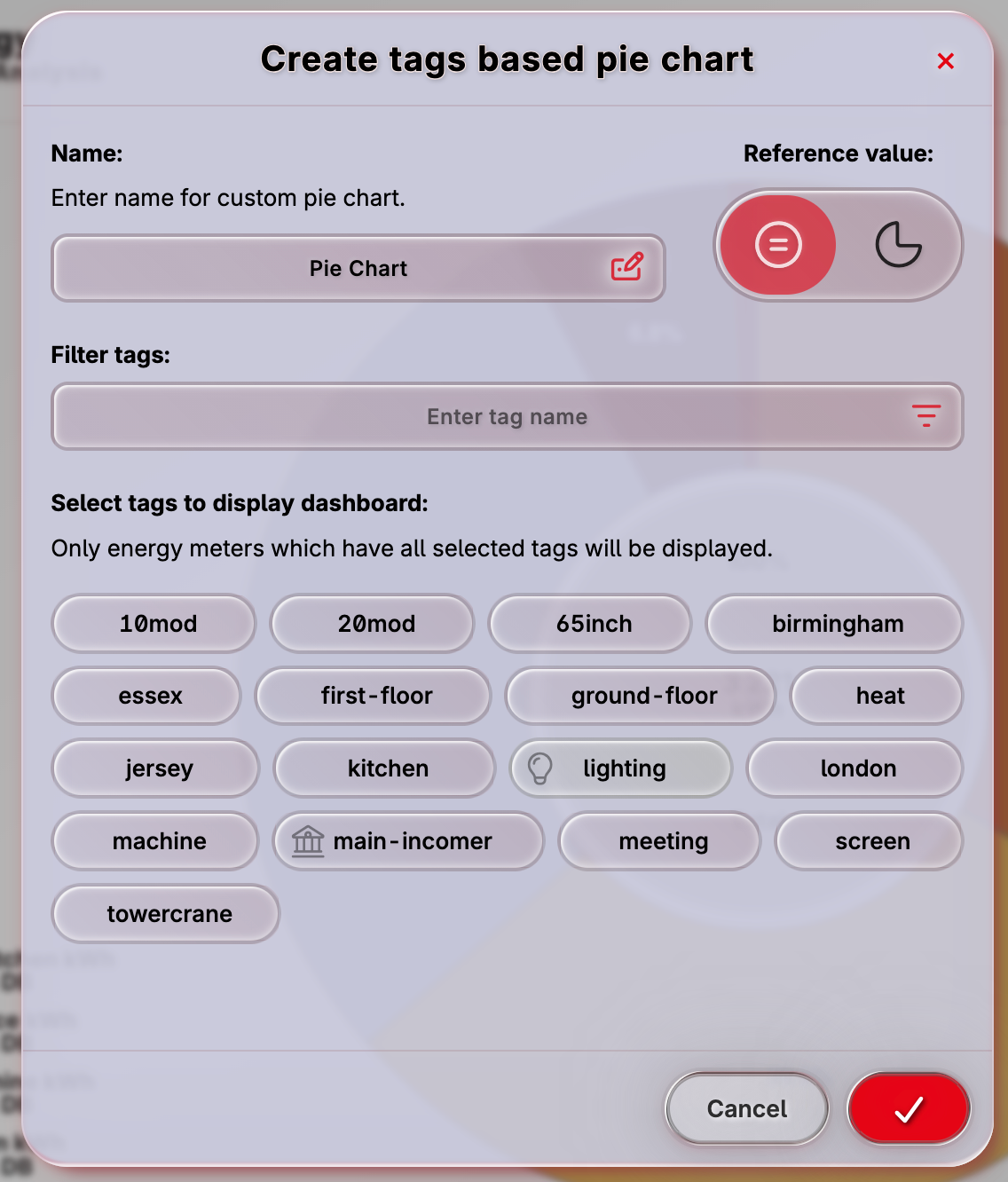
-
Select manually
Download as image
Any chart can be instantly downloaded as image by clicking in top right corner.