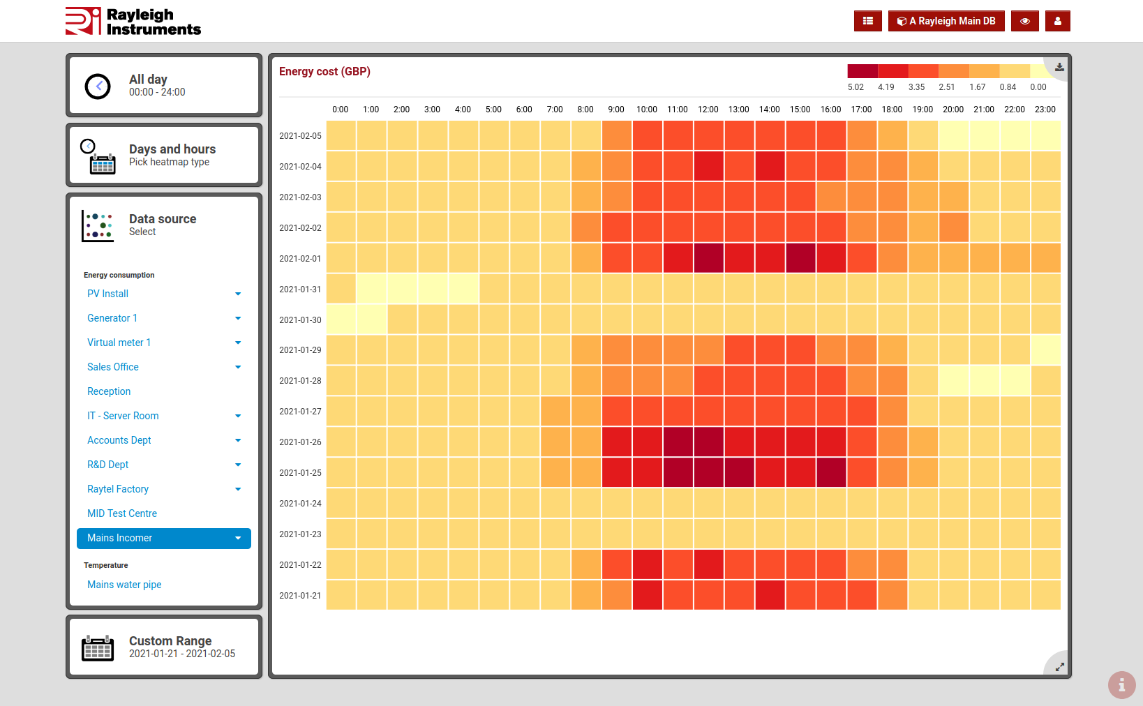
Heat maps
Overview
Heat maps make it easy to compare readings on different days.
This visualization method is a great tool for spoting patterns. You can easily find out when you are using most electricity. This information can be used to locate when energy is wasted or simply to select better suited tariff.
Meters and sensors
rayleighconnect™ heat maps can display data from multiple data sources and provide information such as:
- energy consumption and production,
- energy cost
- average temperatures,
- status of water tanks,
..and much more.
Data aggregation
Three modes of data aggregation are available:
Days
- Each square is one day.
Days and hours
- One square per hour.
- One row per day.
Weekdays and hours
- One square per hour.
- Seven rows, one per each weekday.
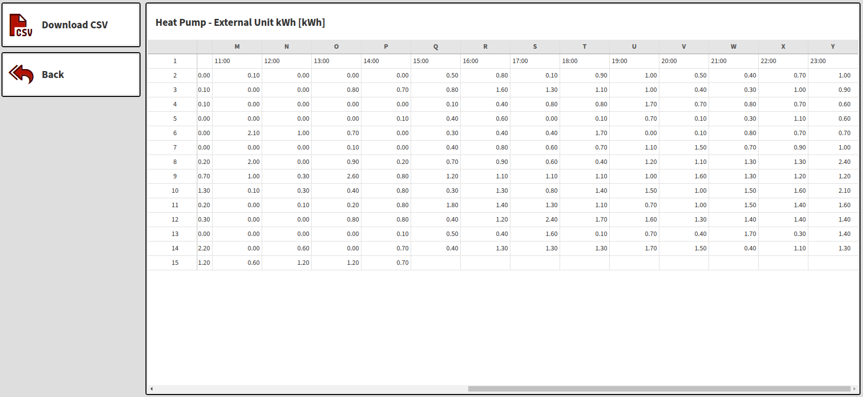
Data Export
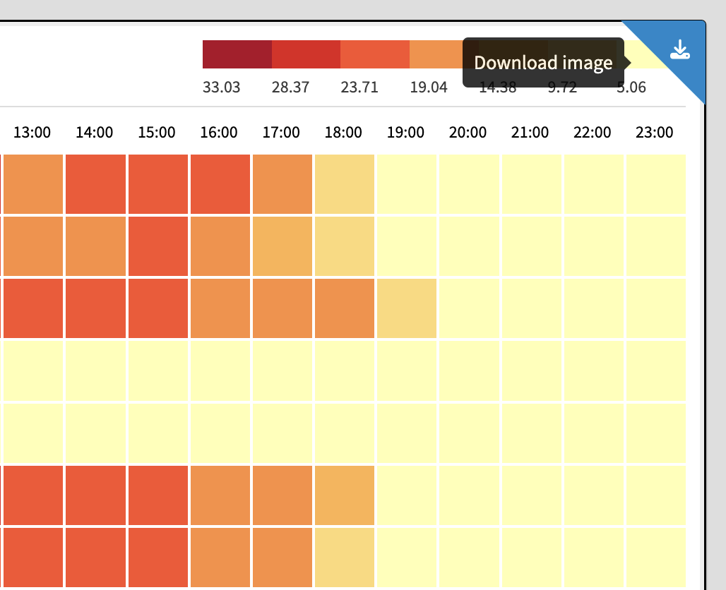
Image
Heat maps can be downloaded in PNG image format.
CSV
Heat maps can be download in CSV format.